Neutral palettes in interior design aren’t just the safe choice. Think of it as a sophisticated foundation that still allows your personality to shine through.
From warm beiges and honeyed oak to cool grays and muted blues, these timeless color schemes create spaces that feel both elegant and adaptable, whether your style leans minimalist, classic, or contemporary.
You’ll find that neutral doesn’t mean boring. In fact, it’s quite the opposite!
When thoughtfully layered with varied textures, tonal contrasts, and meaningful objects, neutral spaces tell your unique story while maintaining a serene atmosphere.
Versatile palettes are especially great in areas dedicated to relaxation. Using them correctly can transform your home into a personal sanctuary.
One that perfectly reflects how your style and unique personality.
Think Neutrals Are Boring? Think Again: How to Create Stunning Spaces with Personality
The Hidden Power of Neutral Colors
Far from being bland, these neutral colors create the perfect foundation for truly personal spaces where carefully selected elements can take center stage.
What exactly counts as ‘neutral’ anyway?
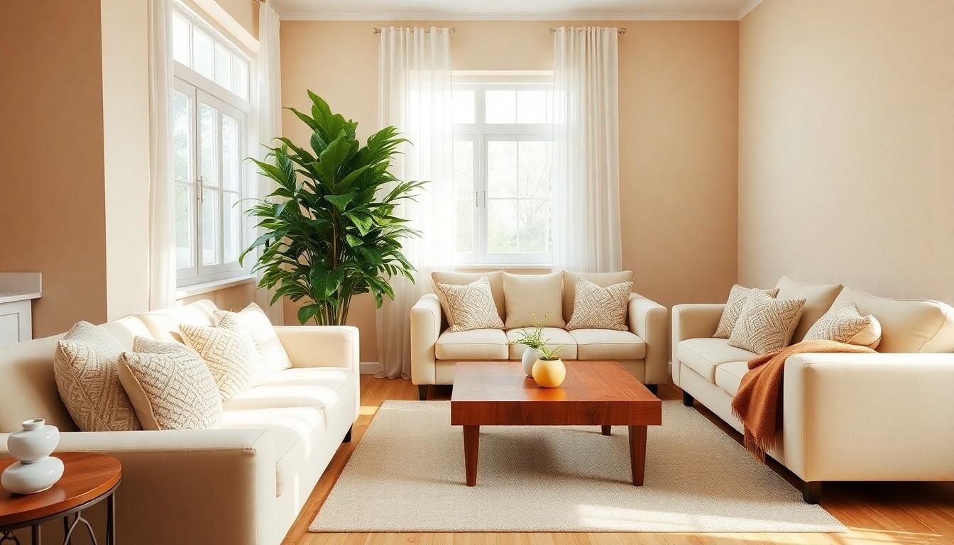
Neutrals include more than just beige and white. This earthy palette encompasses ivory, cream, taupe, various grays, rich browns, and even muted versions of traditional colors like olive green or dusty blue.
Warmer neutrals (with hints of red, orange, or yellow) create cozy, inviting atmospheres while cooler ones (with subtle green, blue, or violet undertones) make a space feel serene and refreshing.
The beauty lies in how these shades harmonize together while providing subtle dimension through tonal variations.
Why designers deliberately choose neutrals (hint: it’s not laziness)
Top designers gravitate toward neutrals because they create enduring backdrops allowing statement pieces to shine.
Neutrals excel in spaces focused on rejuvenation and relaxation, giving you freedom to explore other design elements like texture, form, and contrast.
Rather than restricting personality, neutral foundations provide the perfect canvas against which your unique style can truly pop.
Texture: Your Secret Weapon in Neutral Spaces
Texture serves as the primary storyteller in neutral spaces, adding both visual interest and tactile appeal. With color in the back seat, textural elements come forward to create depth, warmth, and character in your home.
Mix it up: How to pair contrasting textures for maximum impact
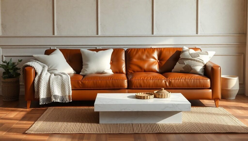
The magic happens when you pair opposites together. Combine rough with smooth, like nubby linen cushions against a sleek leather sofa or chunky knit throws draped over polished wood.
Layer different materials as your design “spices”: weathered wood, cool stone, gleaming metal, reflective glass, and various fabrics each bring their unique character.
A marble coffee table paired with a sisal rug is immediately interesting without needing bright colors.
The richest neutral rooms feature at least 5-7 different textures that complement rather than compete.
Wall treatments that wow without color
Your walls offer prime real estate for adding dimension without disrupting your neutral palette. Textured wallpaper with subtle patterns or grasscloth brings organic warmth while maintaining the room’s serene quality.
Consider dimensional paneling, from classic wainscoting to modern slatted wood features for architectural interest.
Plaster finishes with their slight irregularities catch light differently throughout the day, creating subtle shadows and highlights.
Fabric wall coverings like linen or wool felt add acoustic benefits alongside visual softness.
Even simple techniques like color blocking with different neutral shades create textural contrast that transforms plain walls into sophisticated design statements.
Playing with Shades: Neutral Doesn’t Mean One-Note
Neutral color schemes offer incredible depth and personality when you understand how to play with their subtle variations. The right combination of neutral shades creates sophisticated spaces with visual interest that never feels flat or boring.
Warm vs. cool: The temperature that changes everything
Warm neutrals bring coziness to any room with their subtle hints of red, orange, or yellow undertones. They wrap your space in comfort, perfect for creating inviting living rooms or intimate dining areas.
Cool neutrals, with their green, blue, or violet undertones, deliver a refreshing, serene atmosphere that helps rooms feel more spacious and calm.
The temperature of your neutral palette dramatically shifts the mood: warm tones encourage gathering while cool tones promote relaxation. Try holding paint swatches under different lighting to spot these subtle undertones before committing.
Creating depth through layered tones
Layering similar neutral shades creates subtle dimension that draws the eye through your space.
Start with a base neutral, then add lighter and darker versions of the same color family to build visual interest. For instance, pair cream walls with ivory trim and taupe accents for a monochromatic approach with depth.
Or mix several different neutrals – perhaps dove gray with warm beige and soft ecru – for a more textured look. The contrast between these tones provides visual anchoring points that prevent the space from feeling flat.
Even small tonal shifts between furniture, walls, and accessories create sophisticated layering that makes neutral rooms feel rich and intentional.
Pattern Play: Adding Visual Rhythm Without Breaking the Calm
Patterns breathe life into neutral spaces by creating visual rhythm and interest without disrupting the serene quality. Geometric designs, subtle stripes, and organic motifs all work beautifully within a restrained color palette, adding personality while maintaining harmony.
How to mix patterns without creating chaos
The key to successful pattern mixing lies in your neutral foundation. Since your color palette is already restrained, you’ve got more freedom to play with diverse designs.
Start with a dominant pattern that incorporates your main neutral shades, then add 1-2 complementary patterns at different scales. Geometric designs pair beautifully with organic motifs because they create balanced contrast.
Try combining a subtle herringbone throw with a larger-scale botanical print cushion while keeping everything in the same neutral family. The limited color range naturally unifies these different design languages, preventing visual overwhelm.
The rule of three: Balancing pattern sizes throughout your space
Following the rule of three creates visual balance when incorporating patterns.
Include a large-scale statement pattern (like wallpaper or an area rug), a medium-scale pattern (on throw pillows or drapery), and a small-scale pattern (in accessories or smaller textiles).
Distribute these patterns thoughtfully throughout your space rather than concentrating them in one area.
For example, a subtle striped wallpaper might pair with medium geometric cushions and small-patterned ceramic accessories, creating rhythm that leads the eye around the room without disrupting the calm, neutral foundation.
Statement Pieces That Steal the Show
Focal points create visual interest in neutral spaces by drawing the eye and adding personality. The right statement pieces transform a bland room into a captivating design that reflects your unique style without overwhelming the soothing backdrop.
Lighting that transforms your space
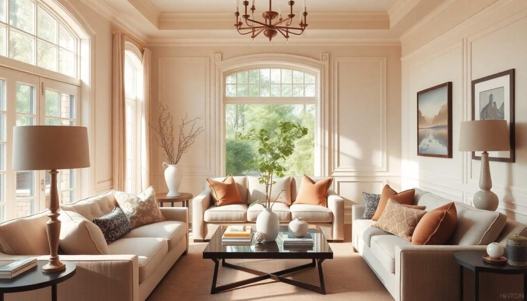
Lighting fixtures serve as artistic focal points that dramatically reshape neutral environments. A sculptural pendant or statement chandelier instantly draws attention while casting beautiful shadows that add dimension.
Diffused lighting enhances soft tones, while strategically placed lamps highlight architectural features you love.
Layer your lighting with a mix of ambient illumination for overall brightness, task lighting for functional areas, and accent lighting to showcase special elements. This creates flexibility for different moods throughout the day.
Art and accessories that tell your story
Artwork introduces color, pattern, and personality to neutral rooms while revealing your unique perspective. Large-scale photography, bold paintings, or textural wall hangings create immediate visual anchors that visitors notice first.
Personal collections displayed thoughtfully. Whether vintage cameras, handcrafted ceramics, or travel souvenirs they add character and spark conversations.
These carefully chosen pieces transform understated backgrounds into galleries of your life experiences, making neutral spaces feel decidedly personal.
Standout furniture pieces that anchor the room
Statement furniture with distinctive shapes, unusual materials, or exceptional craftsmanship provides the perfect counterpoint to neutral backgrounds.
A velvet sofa in a rich hue, an artisanal wooden dining table with live edges, or a uniquely shaped accent chair can become the room’s centerpiece.
Position your statement furniture where it’ll naturally draw attention, floating in conversation areas or centered on architectural features like fireplaces or windows.
Strategic Color Pops: Less Is More
Adding color to neutral spaces doesn’t require a complete palette overhaul. Strategic pops of color create visual interest while maintaining the calming essence of your neutral foundation.
The earthiness factor: Terracotta and spice tones
Warm earth tones bring a cozy, grounded feeling to neutral rooms without overwhelming them.
Terracotta, with its rustic charm, adds instant warmth through accent pieces like vases, planters, or throw pillows.
Cinnamon, amber, and ochre tones complement nearly any neutral backdrop, as they’re especially striking against cool grays and taupes. Spice-inspired hues create an inviting ambiance while maintaining design sophistication.
Try incorporating these colors through smaller accessories that can be easily swapped out as your style evolves.
Going bold: Where and how to place vibrant accents
Bold color moments work best when they’re purposefully placed and limited in number. Consider adding a mustard yellow cushion or sapphire blue throw to create distinct focal points that draw the eye.
The key is balance. One or two vibrant accents make a statement but too many create visual noise.
Place these bold touches in natural gathering areas like seating arrangements or entryways where they’ll have maximum impact.
Accessories offer low-commitment ways to experiment with color: pillows, art pieces, decorative objects, and small furniture items all provide perfect opportunities for introducing those eye-catching hues.
The greenery effect: Plants as the perfect color accent
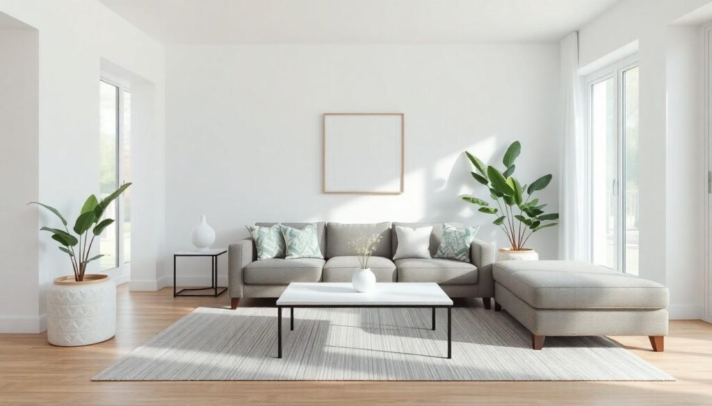
Plants offer the most natural way to introduce color into neutral spaces.
Beyond their aesthetic appeal, they enhance the organic quality of a room while improving air quality. Varying leaf shapes, sizes, and green tones create subtle color contrast without disrupting your peaceful palette.
Consider dramatic fiddle leaf figs for height, trailing pothos for softness, or sculptural succulents for texture.
The organic irregularity of plants provides a perfect counterbalance to the clean lines often found in neutral designs.
Position greenery near windows where they’ll thrive and create beautiful shadow play on your neutral walls.
Adding Shimmer: Metallic Elements That Elevate
Metallic finishes bring that perfect touch of luminosity to neutral spaces. They’re the secret ingredient that transforms understated into unforgettable, adding depth and sophistication without overwhelming your carefully crafted palette.
Mixing metals: The new design rule
Gone are the days when matching all your metal finishes was the golden rule. Today’s most interesting spaces boldly mix their metallics.
Gold and brass add cozy warmth to neutral rooms, while silver and chrome deliver cool sophistication. Try incorporating bronze or copper elements for earthy elegance that grounds your space.
The key? Create intentional contrast rather than accidental clashing.
Anchor your design with a dominant metal (about 60% of your metallic elements), then add 1-2 complementary metals as accents.
Mirror magic: Reflecting light and expanding space
Mirrors do double duty in neutral spaces; both functional and transformative. Strategically placed mirrors amplify natural light, bouncing it into dark corners and instantly brightening neutral palettes that might otherwise feel flat.
They’re also spatial illusionists, making rooms feel significantly larger than they are. Try positioning a mirror opposite a window to maximize light reflection, or use a collection of smaller mirrors as an artistic focal point.
In neutral rooms, consider mirrors with subtle metallic frames that introduce shimmer without competing with your carefully curated calm.
Finding Your Balance: The Art of Neutral with Character
Embracing natural palettes isn’t about playing it safe.
It’s on you to create a thoughtful canvas that lets your personality shine through. Just keep in mind that your home should tell your story when people come to visit.
Remember that texture breathes life into neutral spaces. From rough-hewn wood to smooth velvet metals and natural greenery you have countless ways to add dimension without disturbing the peaceful foundation.
The most successful neutral interiors balance restraint with personal expression. They invite you to slow down notice subtle variations and appreciate the intentional details that make a house truly feel like home.
By mastering these principles you’ll create spaces that feel both sophisticated and deeply personal. Rooms that will continue to evolve with you as they serve their function.