Ever wondered why you feel energized in a vibrant red kitchen but instantly relaxed in a soft blue bedroom?
It’s not just coincidence; it’s color psychology at work in your home. Color is far more than simple decoration, and it’s a powerful design tool that directly influences your emotions, behavior, and mental well-being.
The colors surrounding you can transform your house into a true sanctuary that supports different needs throughout your day, from relaxation and creativity to productivity and social connection. With thoughtful selection, you can create spaces that actively promote your well-being using nothing more complicated than paint and fabric choices.
As our understanding of environmental psychology continues to evolve, so does the potential for color to become your accessible tool in crafting a home that truly nurtures your health and happiness.
How Colors Can Actually Change Your Mood at Home
Colors don’t just make your home look good – they actively influence how you feel in each space. The right palette can transform your everyday living experience by triggering specific emotional and physiological responses.
More Than Just Pretty: Why Color Psychology Matters
Color psychology isn’t just designer talk – it’s backed by real science. Different hues trigger measurable changes in your heart rate, blood pressure, and even brain activity.
That’s why a bright red kitchen might energize you while a soft blue bedroom helps you unwind after a long day.
The Science Behind Your Color Choices
Your brain processes color signals and releases different hormones in response.
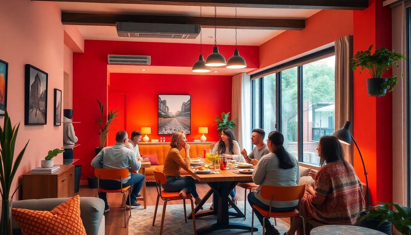
Blue tones can lower blood pressure and slow breathing, creating that calm feeling perfect for bedrooms. Meanwhile, warm colors like red and orange actually increase your heart rate and stimulate conversation – great for dining rooms where you want lively dinner chats.
How Your Ancestors Knew About Color Psychology All Along
Long before scientific studies, cultures worldwide instinctively understood color’s power. Traditional Chinese design used red for celebration and good fortune.
These weren’t random choices – they were early recognition of how different colors made people feel in their environments. Your natural color preferences might even be influenced by these deep cultural connections passed down through generations.
Mediterranean cultures painted doors blue to ward off evil spirits and create tranquility.
The Magic Formula: Using the 60-30-10 Rule

The 60-30-10 rule is a designer’s secret weapon for creating balanced, harmonious spaces without overthinking color schemes. It’s a simple formula that takes the guesswork out of combining colors while still allowing your personality to shine through.
Breaking Down the Numbers
The 60-30-10 rule divides your color palette into three strategic proportions:
- 60% goes to your main color, covering walls, ceilings, and large furniture pieces. This dominant shade sets the room’s overall mood.
- 30% belongs to your secondary color, appearing on furniture, curtains, or an accent wall. It creates visual interest and supports your main color.
- 10% is reserved for your accent color, used sparingly on decorative elements like pillows, artwork, or small accessories. These pops of color add personality and energy.
This distribution creates natural visual harmony while providing enough contrast to keep spaces from feeling flat or overwhelming.
When to Stick to the Rules (And When to Break Them)
The 60-30-10 rule works beautifully for most traditional and contemporary spaces where balance is key. Stick to it when:
- You’re feeling overwhelmed by color choices
- Working with a neutral palette that needs structure
- Designing formal spaces like living rooms or offices
But don’t be afraid to bend the rules for:
- Eclectic or bohemian styles that thrive on creative color play
- Monochromatic schemes where you might use 90-5-5
- Bold personalities who crave more vibrant accents (try 60-20-20)
The formula isn’t meant to restrict your creativity; it’s a starting point that you can adjust to suit your personal style and the feeling you want to create.
Color Families and Their Superpowers

Different color families evoke specific psychological responses that can transform your living spaces. Each color group offers unique benefits that you can leverage to create the perfect mood in any room.
The Energizers: Red, Orange, and Yellow
Warm colors act as natural stimulants in your home, literally raising your heart rate and blood pressure. Red walls in dining areas spark appetite and conversation, while orange spaces foster creativity and social connection.
Yellow brings sunshine indoors with its optimistic vibe – but be careful about using too much, as it can sometimes trigger frustration or anxiety. These energizers work perfectly in spaces where you want movement, anticipation, and engagement – think kitchens, dining rooms, or creative workspaces.
The Chill Pills: Blue, Green, and Purple
Cool colors deliver tranquility and relaxation throughout your living spaces. Blue doesn’t just feel calming – it actually lowers blood pressure, enhances focus, and improves sleep quality.
Purple adds a touch of luxury while maintaining that peaceful cool-color vibe. These shades transform bedrooms, bathrooms, and home offices into restorative retreats where you can escape the day’s chaos and recharge.
Green connects you to nature, reducing stress and creating balance in busy rooms.
The Versatile Players: Neutrals and Earth Tones
Neutral colors offer incredible flexibility while still influencing how you feel in a space.
They’re especially valuable in open-concept homes where you need smooth transitions between different functional areas or in smaller spaces that could feel cramped with bolder color choices.Beiges, grays, whites, and earth tones create sophisticated foundations that don’t overwhelm the senses but still provide subtle psychological benefits.
These chameleons work as perfect backdrops that can lean warm or cool depending on your accessories and accent pieces.
It’s All About the Vibes: Color Intensity and Lighting

Colors work their magic differently depending on their intensity and the lighting around them. These factors can completely transform how a space feels and functions throughout the day.
Bright vs. Soft: Finding Your Intensity Sweet Spot
The same color creates entirely different moods based on its intensity. The key is matching intensity to the room’s purpose: what do you want to feel when you’re in that space?
A soft sage green bedroom helps quiet your mind, while a gentle lavender bathroom sets the stage for relaxation.
Meanwhile, muted or pastel versions of these same colors create calming, soothing environments.
Bright, vivid colors energize your space and stimulate activity, which is perfect for areas where you need a mental boost.
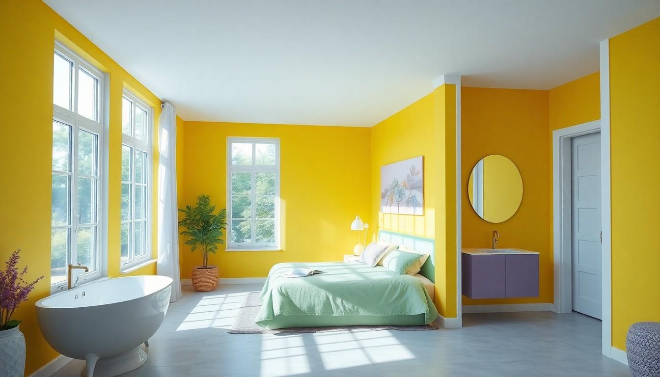
A vibrant yellow kitchen might inspire morning creativity, while a saturated blue meditation room could heighten focus.
The Lighting Game-Changer
Lighting transforms how colors appear and perform in your home.
That perfect gray might appear blue in morning light or take on a warmer cast in evening lamplight.
Artificial lighting dramatically alters perception; warm lighting enhances red and yellow undertones, making spaces feel cozier, while cool lighting accentuates blues and greens for a more refreshing feel.
Even the same wall can look like it’s painted different colors as the light changes throughout the day.
Natural daylight reveals a color’s true nature and all its subtle nuances, which is why paint swatches look different at the store than at home.
Why You Should Test Colors at Different Times
Colors perform an amazing disappearing act throughout the day, shifting their appearance as lighting conditions change.
This testing phase reveals how colors truly behave in your unique space rather than how they look on a paint chip.
Paint small swatches on different walls and check them in morning light, afternoon sun, and evening lamplight before committing. Also consider seasonal variations—a color that feels cozy in winter might seem overwhelming in summer’s bright light.
That dreamy blue-gray that looked sophisticated at noon might read as dull and flat by dinnertime.
Testing paint samples under various lighting conditions isn’t just helpful; it’s essential for avoiding costly mistakes.
Room-by-Room Color Strategies
Color choices dramatically impact how each space in your home functions and feels. The right color palette can transform ordinary rooms into spaces that support your daily activities and emotional wellbeing.
Living Room Colors: Creating Your Social Hub
Living rooms thrive with thoughtful color choices that match their dual purpose.
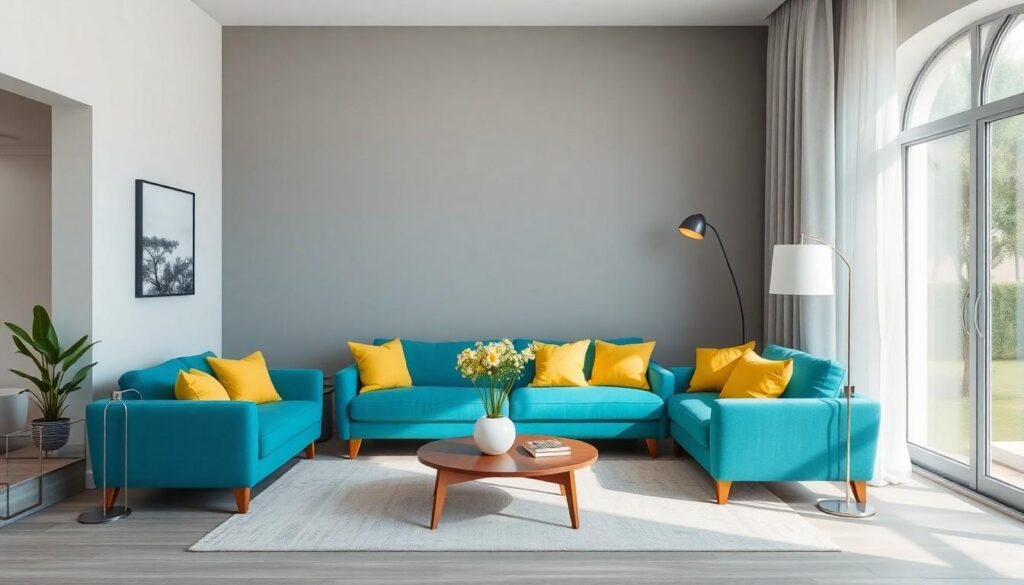
For a more relaxed vibe, cool blues and soft greens help everyone unwind after a long day.
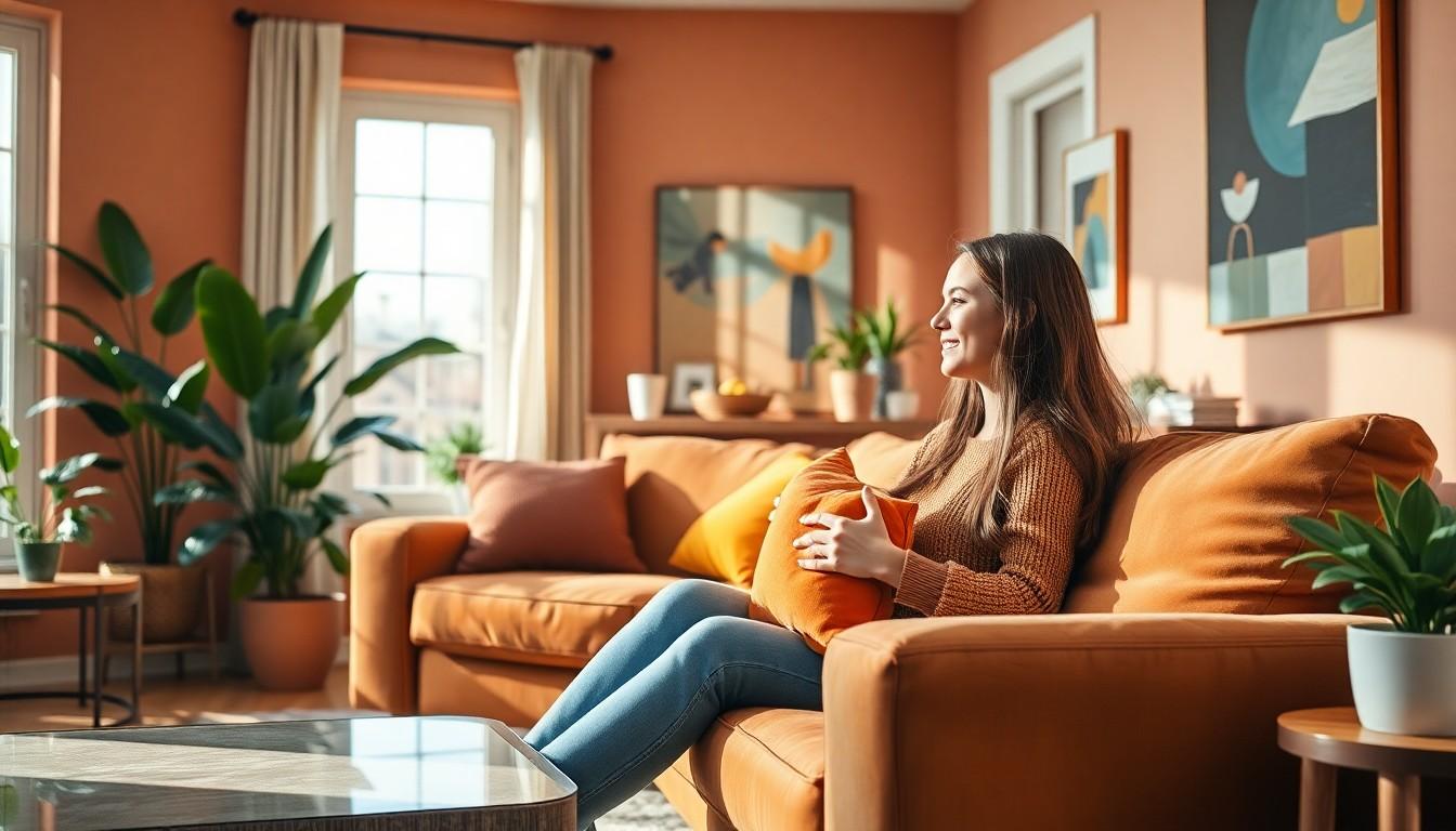
Warm tones like terracotta, golden yellow, or rust reds spark conversation and create an energetic atmosphere when you’re entertaining.
Try painting your largest walls (60%) in a neutral shade, adding warmth through furniture (30%), and incorporating pops of bold color in accessories (10%). This balanced approach lets you adjust the room’s energy level through easily changeable elements like pillows and artwork.
Kitchen Colors That Actually Make Food Taste Better
Kitchen colors genuinely affect how food tastes and how much you eat. Red and orange stimulate appetite – there’s a reason so many restaurants use these colors!
A warm yellow kitchen creates an energetic cooking environment that makes meal prep more enjoyable.
If those feel too intense, light blues and soft greens offer a refreshing alternative that still complements food beautifully. These cooler tones create a clean, fresh atmosphere that works especially well in smaller kitchens or spaces that receive limited natural light.
Earth tones like terracotta and brown add grounding warmth to cooking spaces.
Bedroom Colors for Better Sleep
Your bedroom color palette directly impacts sleep quality. Cool blues lower blood pressure and slow heart rate, creating the perfect physiological conditions for rest.
Soft greens and lavenders similarly reduce stress hormones and promote deeper relaxation.
For a cozier feel, warm neutrals like taupe, beige, and muted browns create a secure, nest-like environment that feels protected from the outside world. Light blue walls with white trim expand smaller bedrooms visually, while deeper blue tones can make larger rooms feel more intimate and conducive to rest.
Avoid bright reds or oranges that stimulate brain activity.
Home Office Colors That Boost Your Brain Power
Blue dominates as the productivity powerhouse for home offices.
This focus-enhancing color improves concentration and cognitive performance – perfect for detail-oriented tasks. Studies show blue environments lower blood pressure while improving task performance.
Green offers balanced brain support by reducing eye strain and mental fatigue during long work sessions.
These provide creative sparks without overwhelming your concentration.
It bridges the gap between stimulation and relaxation. For creative work, add small doses of energizing yellow or orange as accents rather than primary colors.
Bathroom Colors: Between Spa Day and Wake-Up Call
Blue and white combinations create that perfect spa-like bathroom retreat. These colors evoke pristine cleanliness while promoting the tranquility you crave during self-care moments.
Soft blue walls with white fixtures creates an expanded sense of space in smaller bathrooms.
Earthy neutrals like warm beige, soft taupe, and muted browns add comfort and intimacy to your morning routine.
Green works beautifully in bathrooms by connecting to nature while balancing cool refreshment with warm comfort – like bringing a touch of the outdoors into your private sanctuary.They create a cozy atmosphere that feels especially nurturing during winter months.
Creating Color Harmony
Color harmony transforms your interior from a random collection of colors into a cohesive, emotionally resonant space. Creating balance isn’t about rigid rules; it’s about understanding how colors relate to each other and affect your mood when combined.
The One-Color Wonder: Monochromatic Magic
Monochromatic schemes take the guesswork out of color coordination by using just one color in various forms.
A pale blue bedroom with navy accents and powder blue textiles creates a layered, sophisticated look while maintaining a calm, cohesive feel throughout.
This approach works beautifully in smaller rooms where too many colors might feel chaotic.
Mix different shades, tints, and saturations of your chosen hue to create subtle depth without overwhelming the space.
Good Neighbors: The Analogous Approach
Analogous color schemes tap into nature’s own playbook by using colors that sit next to each other on the color wheel.
A living room in shades of green with touches of teal creates a refreshing, balanced environment that feels both coordinated and naturally varied.
Think blue paired with blue-green and green, these neighboring hues create a natural flow and harmony that feels effortless.
This approach works perfectly in living spaces where you want a smooth visual transition without harsh contrasts.
Opposites Attract: Using Complementary Colors
Complementary colors pack a visual punch by pairing hues from opposite ends of the color wheel, such as blue with orange or purple with yellow. The key to making this dynamic approach work is balance: let one color dominate while the other serves as an accent.
This strategy creates spaces with energy and depth while maintaining visual harmony.
A predominantly neutral room with deep blue walls and small pops of orange in throw pillows or artwork creates anticipation without overwhelming the senses.
Making It Personal: Beyond the Color Rules
Color principles give you a great starting point, but your space should ultimately reflect who you are. The psychology of color takes on new dimensions when filtered through personal experiences and cultural backgrounds.
When Culture Changes Everything
Color interpretation varies dramatically across different cultures.
Your cultural background might be why certain “universally calming” colors make you feel anything but relaxed.
Red signals danger in some contexts, but represents good fortune and celebration in Chinese tradition. These cultural differences are not just interesting facts; they are deeply ingrained emotional responses that affect how comfortable you feel in a space.
In Western societies, white often symbolizes purity and weddings, while in many Eastern cultures, it’s associated with mourning.
Your Personal Color Story
Your unique experiences create personal color associations that override general psychology principles.
When designing your space, take time to reflect on colors that have positive emotional connections in your life, because these personal associations often guide you to choices that feel genuinely right.
These personal connections often trump textbook color responses.
Perhaps that supposedly “appetizing” red kitchen paint reminds you of a stressful first apartment.
Maybe blue reminds you of childhood vacations by the sea, making it more energizing than calming for you.
Finding Your Perfect Balance
Creating your ideal space means blending psychology principles with personal preferences. Start with color psychology as your foundation, then adjust based on your individual responses.
The most effective environment balances universal principles with what speaks to your heart.
Paint a sample board you can move around to see how the color feels in different lighting and alongside existing furnishings. Trust your gut reactions – if a supposedly “energizing” yellow makes you feel anxious instead of inspired, it’s not right for your space.
Test small areas before committing to entire rooms.
Practical Tips for Using Color Psychology at Home
Color psychology doesn’t have to be complicated. You can easily integrate these principles into your home with some straightforward approaches that blend science with your personal style.
Creating Flow Between Rooms
Create a cohesive color story throughout your home while allowing each room to have its own personality. Start with a neutral foundation that runs through all spaces, then layer room-specific colors that reflect each area’s purpose.
Doorways and hallways offer perfect opportunities to transition between color zones with subtle gradient effects or complementary accent pieces.
Your kitchen might feature energizing yellows, while your bedroom showcases calming blues, yet they still feel connected through shared neutral tones or complementary accents. Think of your color scheme as a conversation between rooms rather than isolated statements.
The Testing Phase: Don’t Skip This Step
Colors transform dramatically under different lighting conditions, making testing an absolute must. Paint large swatches (at least 2×2 feet) on multiple walls and observe them throughout the day; morning sunlight, afternoon shadows, and evening lamp light can reveal surprising color shifts.
Don’t rush this process; live with your test swatches for at least 48 hours before making final decisions to ensure they create your desired emotional response in all conditions.
Take photos at different times and under various lighting conditions to compare how colors perform. What appears as a soothing sage green in daylight might turn muddy gray under artificial lighting.
Commitment-Phobic? Try These Low-Risk Approaches
Not ready for a full color overhaul? Introduce color psychology through flexible elements like throw pillows, artwork, or area rugs that can be easily swapped as your preferences evolve.
Even colored lightbulbs can temporarily transform a space’s emotional impact without any permanent changes.
Try a bright yellow throw in your home office when you need a creativity boost, or bring calming blue accessories into your bedroom during particularly stressful periods. Removable wallpaper offers another low-risk option for testing bold colors in specific areas.
These smaller investments let you experiment with how different hues affect your mood without major commitment.
Transform Your Home, Transform Your Mind
The science of color psychology offers you a powerful tool to shape not just your home’s appearance but your daily experiences within it. By understanding how different hues impact your emotions you can intentionally design spaces that support your wellbeing and activities.
Remember that while design principles provide helpful guidance your personal responses to colors matter most. Your unique cultural background experiences and preferences should guide your choices above all else.
Start small with accessories if you’re hesitant about making bold color commitments. As you become more attuned to how colors affect you you’ll develop confidence in creating spaces that truly feel like home.
Your intuition combined with color psychology knowledge empowers you to craft environments that nourish both your aesthetic sense and emotional health.

